Most technology firms struggle to find the optimal balance between complexity and adoption. This challenge has far-reaching implications for technology companies. Understanding these dynamics can help tech companies gain more customers, increase the value each customer realizes, and improve customer success metrics.
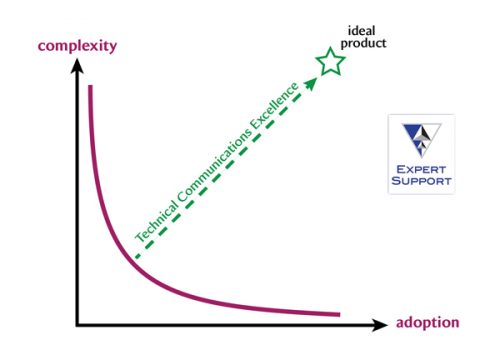
In this graphic, the vertical axis represents complexity or power. Complex technologies empower users to do amazing things in multiple ways and enable them to get more value from technology. Adoption of powerful technology is often impeded by complexity from the steep learning curves and confusing UX that can overwhelm new users.
The horizontal axis represents adoption, which in this context is the percentage of users in the total available market that adopt and use 100% of the technology’s capabilities.
One of the key forces that can drag every product on the curve toward the ideal is represented by the arrow to the star, technical communications excellence. This is a force vector that moves the entire curve up and to the right, making powerful products more usable and increasing adoption rates. The tech comm field includes a variety of specializations — information architecture, UX, documentation, training, support materials — all designed to empower the user to understand the technology and extract more value from it.
Just About Every Technology-based Product Lands Somewhere on this Chart
An example of a high-complexity, low-adoption product is Mentor IC design software, which is used by semiconductor designers. Comparatively speaking, Mentor sells powerful but complex software tools exclusively used by IC designers, so the audience for this software is very limited. Excellent technical communication can help simplify complexity for such complicated but powerful products, and enable more users to adopt and use more of their functionality.
An example of a widely adopted, but under-utilized product is the camera app in my iPhone XR. In this case, anyone with this phone can use the camera app to snap simple photos, but as several billboards in the Bay Area prove, this same camera app can take truly stunning, professional looking photographs. With excellent technical documentation and training, more users can learn to use the powerful features of their camera app, thereby increasing realized value.
The curve in the graphic represents the entire spectrum of technology products. Think of your product, and consider where it falls on this chart. Is it close to one of the ends?
Every product team’s goal is to build powerful products that everyone uses to the maximum of their capabilities. In essence, every team’s goal is to drag their product toward the star, which represents that ideal.
But that’s easier said than done.
It’s certainly possible to build powerful technology. But if you only focus on power, the resulting complexity can prevent large-scale adoption. On the other hand, it’s also possible to build relatively simple technology that everyone can use, but make it so simple that users don’t realize much of its value.
Reach for the Star if You Can
Of course, some products land on the star right out of the gate: Lotus 123. The Mac. Netscape Navigator. The iPhone. Adobe Acrobat. Twitter. Google Search. Uber. All achieved early mass-market adoption and delivered incredibly innovative value to their new users right away.
In recent weeks, we’ve used this graph to help tech executives understand the leverage that technical communications excellence delivers across the entire spectrum of technology-based products. When they get it, they often support increased funding for related initiatives, and of course, we like that.
Can this graph help you in similar conversations? Either way, we’d love to hear your feedback.
And I invite you to sign up for our email list so we can let you know about important posts and updates.
